Information Architecture
How to design an intuitive, easy to use system? Start with the architecture, add a clean, well-crafted interface, and just the right touch of graphic design.
An elegant design appears simple. It leads the person to do whatever was intended and provides options to do more. How to achieve that clear, simple elegance is not so simple and often not very clear.
Information architecture should be designed for function. It supports all the information that may exist and should allow for more to be added – easily, without rework, and without having to spend hours figuring out where to put it.
Interface design should compliment the information architecture. Colors, design elements, and presentation should enhance and contribute to the form.

Before the internet, before search engines, before keywords, there were indices and catalogs and libraries. Libraries with thoughtful collections and indices compiled by people who knew something about the subjects and could identify how this was related to that.
Library science is not simply an archaic system for cataloging of dusty old books or scrolls; it’s a well-designed system, a framework based on comprehensive methods — an information architecture.
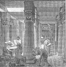
Artistic Rendering of The Great Library of Alexandria. by O. Von Corven from Tolzmann, Don Heinrich, Alfred Hessel and Reuben Peiss. The Memory of Mankind. New Castle, DE: Oak Knoll Press, 2001. (public domain)
The architect should strive continually to simplify;
the ensemble of the rooms should then be carefully considered that comfort and utility may go hand in hand with beauty.
– Frank Lloyd Wright (1867-1959)